Information Design for Commuters on the A Train
This project originated during a morning commute when I observed a new digital graphic on the A trains illustrating the line's stops. As a designer, I thought this could be better and identified the potential to optimize the system. Providing the waiting time for connections could significantly improve the overall user experience, offering commuters a more informed and efficient journey.
Inspiration
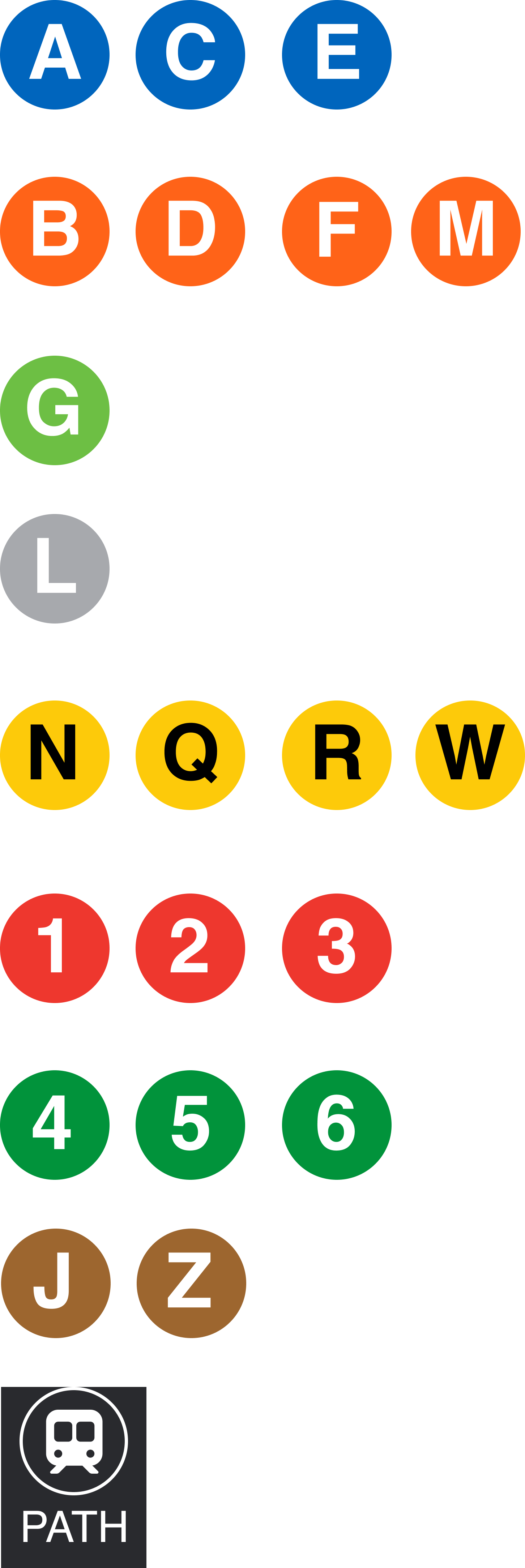
Just a quick component set that I put together in Figma to help lay everything out.


